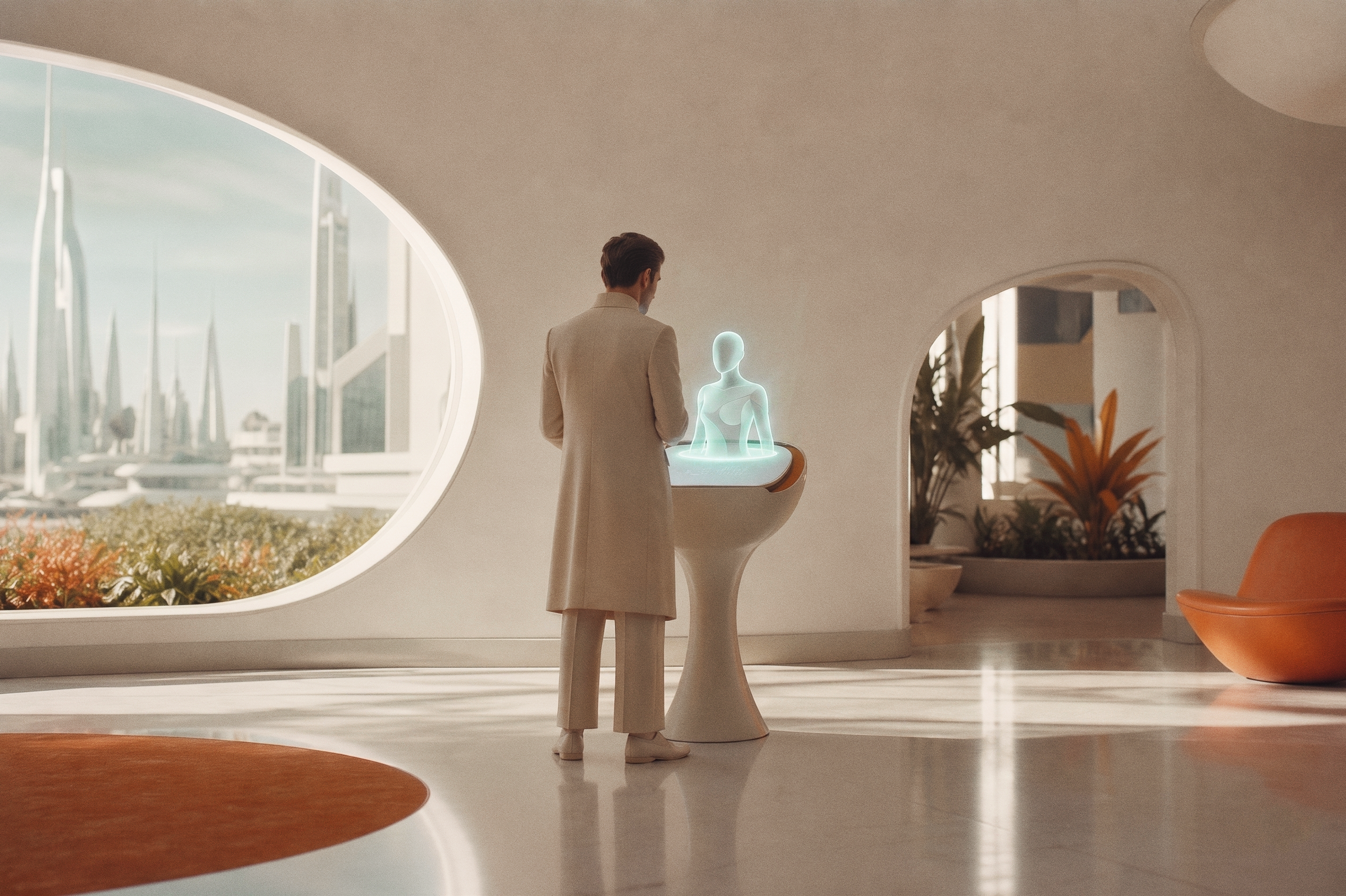
How identity becomes interface.
This is the backbone. Logo, color, type, and photography are the raw materials. Design is how we compose them into things that feel unmistakably Planetary Talent. The grid, the motion, the icons, and worked examples of real work all live here.
The layouts are quiet and modern. The photography and color give them the retro-futurist feeling. That contrast is the whole point: a calm, structured frame around a warm, optimistic world.
Every page earns its character through restraint. Generous whitespace, soft corners, flat surfaces, and exactly one wow-factor moment. The principles below apply to every visual decision you make.
Principles to design by
The non-negotiables. Apply across everything.8-point grid, always
Spacing, type, and corner radii step in 4 / 8 / 16 / 32 / 64. No arbitrary values. No 13-px gaps.
Depth from color, not shadow
Flat design. No drop shadows, ever. Cards get a 1-px hairline border and softness from rounded corners.
Soft corners, no squares
Buttons are pills. Cards use 16 to 32 px radii. Nested cards: outer radius minus inner padding.
One focal point per layout
An oversized number, a hero image, or one big Moret statement. The rest of the page supports it.
Ample whitespace
Pages breathe. Cards have at least 24-px padding, sections at least 48-px. Empty space is part of the design.
No gradients, no noise, no slop
20% tints handle background variety. Photography handles texture. We don't fake either with effects.
Go deeper
Four pages. Everything you need to build on-brand.