05 · Design / Examples
The system in action.
Four surfaces, four different jobs. Product UI has to disappear so the work shows through. Posters and social have to stop a thumb. The marketing site sits in between. These are live, responsive layouts, not screenshots, so you can see how each one holds together as it flexes.
The line that separates the four: Moret is the voice of the universe, so it leads on posters, social, and the marketing site. It never appears in product UI. In the app, DM Sans does everything, and the retro-futurism lives in the photography and color instead of the type.
Product UI
An open-roles view. Calm, dense where it needs to be, one clear action.

Dashboard
Open roles
My team
Settings

Welcome, Mark
Here's the status of your 3 open roles.
Front-end engineer
Hiring a front-end engineer with strong React, TypeScript, and UI development experience.
View job description
View ideal talent
Roles posted
8
Total applicants
7,000
Story evaluations
5,000
Screens
700
Shortlisted
4
Shortlist
The best humans on the planet for this role.
List
Card
Search
Latest
JH
John H.
Product-focused front-end developer
Match
95%
Available
1/7/26
Salary ask
3.5k to 4k
TW
Theresa W.
Design systems and front-end
Match
93%
Available
1/7/26
Salary ask
3.5k to 4k
DL
Devon L.
Full-stack, front-end leaning
Match
91%
Available
2/2/26
Salary ask
3.5k to 4k
Scheduled interviews
12
Jun
Initial interview with Guy H.
11:00 to 11:30 AM
Full-stack engineer
Full-stack engineer
23
Jun
Get to know with Mark M.
11:00 to 11:30 AM
Front-end engineer
Front-end engineer
No Moret, anywhere
Every string here is DM Sans. Medium for titles and numbers, Regular for body. The serif would make the product feel like an ad.
Tints carry status
Seafoam for positive, gold for attention, purple for scheduled. Status is the only place color is decorative-free and functional.
One primary button
"Start new search" is the only filled button on the view. Everything else is a ghost or a chip.
Human-first language
"The best humans on the planet," not "top talent." Brand voice lives in the copy, not the typeface.
Marketing website
Moret leads. One focal point per screen, generous air around it.
HomeLorePricingBlog
Start hiring
Enter the Planetary Talent Universe
Step inside the universe and explore the lore that fuels our mission.
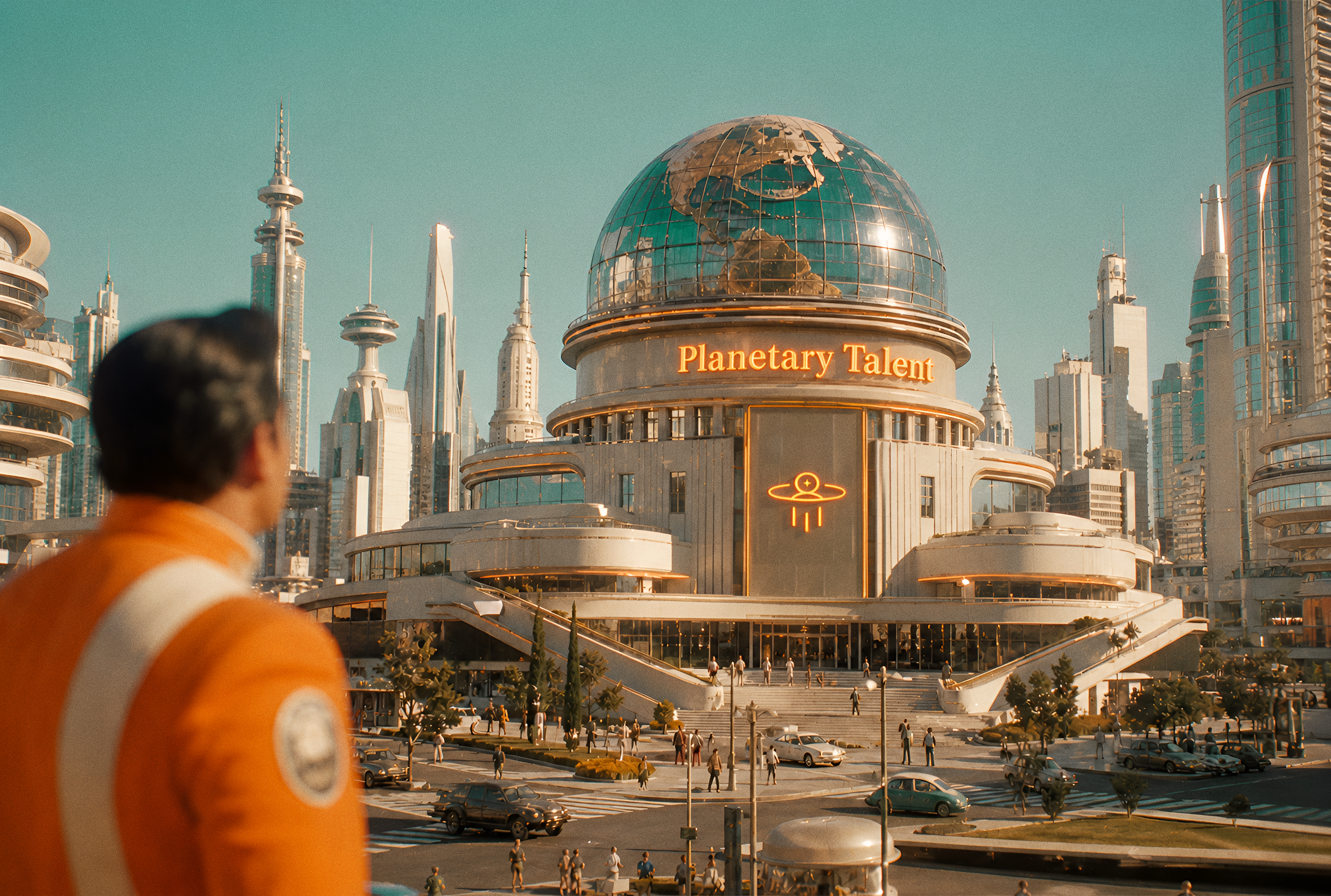
 About us
We are a collective of visionary storytellers, dedicated to helping founders find the right humans.
Moret on the hero only
One oversized serif statement per screen. The lede below it is DM Sans, and it stays quiet so the headline wins.
Floating pill navbar
Backdrop-blurred, 16 px off the top, pill radius. It reads as a control surface hovering over the page, not a band welded to it.
Photography does the world-building
Full-bleed, rounded to the outer card radius, no scrim and no shadow. The image is the retro-futurism.
Pill chips label sections
A small logomark chip introduces a section without a heavy heading. Quiet wayfinding.
Marketing poster
The most expressive surface. Retro ad structure, modern grid.DestinationKepler-22bSector 04
Work from the crystal pools of Kepler-22b!
All exoplanets now cleared for fully remote work.

 Vol.01
No.02
Vol.01
No.02
Transmission002Planetary City
Hire the best human on Earth for every job.
Time to hire
14 days
You meet
Top three
Reach
All of Earth
 No.07
Year2026
No.07
Year2026
Tracked metadata rails
Uppercase DM Sans, tracked wide, justified edge to edge. The rails frame the sheet and do retro work the type can't do alone.
Image-led or type-led
Either a photograph carries the sheet and Moret pays it off underneath, or Moret is the entire sheet and a spec strip grounds it. Never half of each.
Posters don't have a dark mode
Print artifacts render fixed. Light and dark stock are separate designs, not a theme toggle.
One stock color per sheet
Fog stock takes seafoam accents. Flame stock goes all-in on the fill, which means the white wordmark, never the color one.
Social media
Five recurring formats. One idea per post, bold enough to stop a thumb.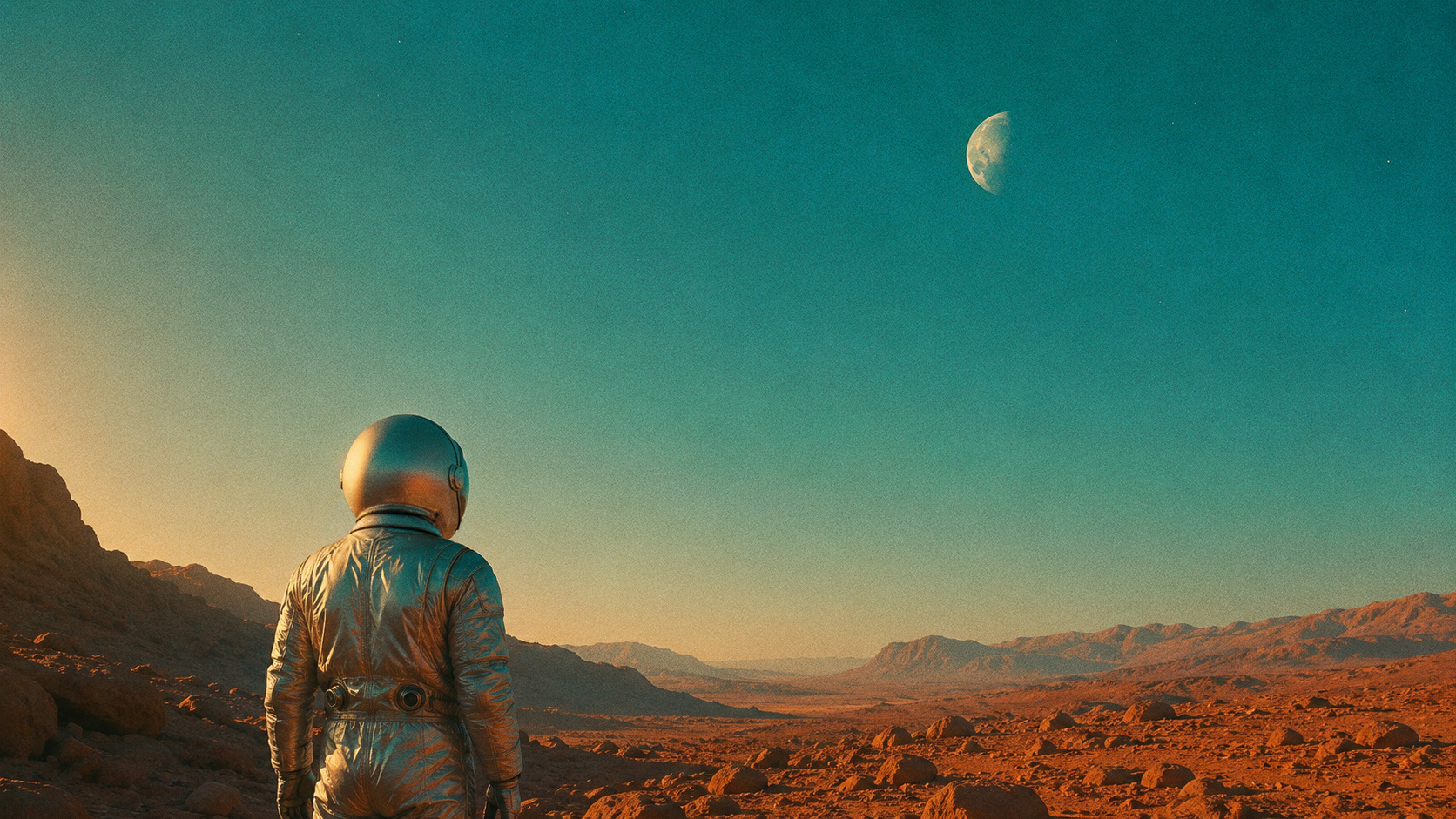
The best hires begin with a better story.

Photo and statementWhite Moret over a dark, uncluttered frame. Never over a busy one.
"As founders, we wanted a low-friction hiring platform that wouldn't slow us down, so we built what we wish existed."
Mark Janzen
Founder, Planetary Talent
Quote cardSet in DM Sans, not Moret. A real person speaking should sound like a person.
We are making Earth's most talented workforce accessible.
TypographicMoret at full volume, centered on a 20% tint. The words are the whole image.
20262026202620262026
Planetary Talent wins Tech Startup of the Year
Presented by Flagship Kansas
AnnouncementOversized numerals as a background field, white card floated on top.
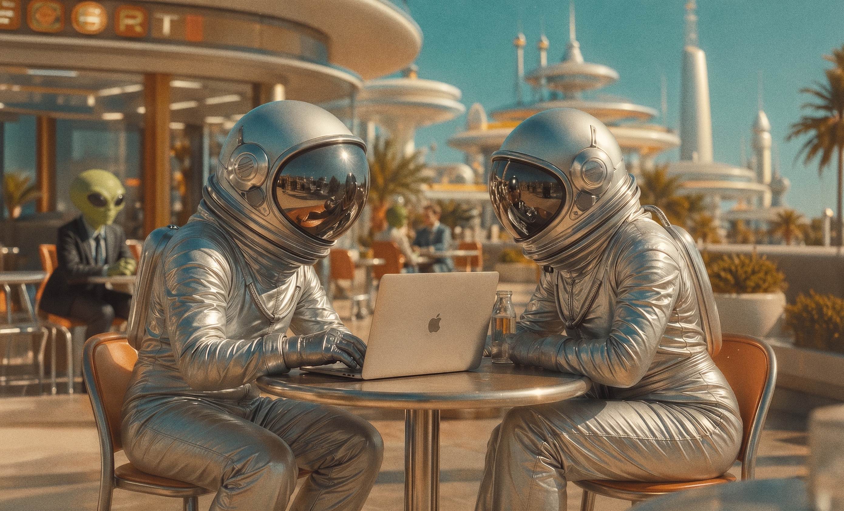
Why story matters at Planetary Talent
Blog post by our interstellar storyteller
Editorial promoType occupies the top third, image anchors the bottom. No scrim needed.
One idea per post
If a post needs a second sentence to make sense, it's two posts.
Tint or photo, never both fighting
A tinted background is its own canvas. Don't put a photograph on top of it.
Type may bleed off the canvas
Only on typographic posts, and only when the first line still reads completely.
No scrims to rescue contrast
Pick a frame with room for type, or move the type onto a solid card.
What goes where
The same decisions in one table.| Decision | Product UI | Website | Poster | Social |
|---|---|---|---|---|
| Moret display type | Never | Hero only | Leads | Leads |
| DM Sans | Everything | Body, UI | Rails, subhead | Quotes, meta |
| Whimsy level | Low. Clarity first. | Medium. One-liners. | High. Full performance. | Medium to high. |
| Film grain | No | Images only | Yes | Images only |
| 20% tint as background | Status chips only | Section rhythm | Accents, not fills | Full canvas for variety |
| Filled buttons per view | Exactly one | One per section | None. It's print. | None. Caption carries it. |
Scroll the table sideways to see every surface.
Before you ship
Eight questions that catch almost everything.
- If it's product UI, is there any Moret left in it?
- Is there one focal point, or are two things competing?
- Is there exactly one filled button on the view?
- Does every spacing value land on the 8-point grid?
- Any shadows or gradients that snuck in?
- Are borders consistent across the group, all or none?
- Is the photography bright and hopeful, never dystopian?
- Does it read as Planetary Talent with the logo removed?