The mark, the wordmark, the lockup.
Our logo is a portal: a gateway to opportunity, with a human figure stepping through. The figure carries a star: the brilliance of the talent we represent. Don't redraw it; use it as supplied.
Meaning of the mark
Every element carries intent.Inspired by the aesthetics of retro-futurism and the boundless optimism of space exploration, our logomark represents a commitment to connecting businesses with extraordinary talent across cultures, borders, and even galaxies. At its core, the mark is a portal: a gateway to new opportunities where talent and innovation converge.





Element by element
Five symbols, one story.The portal
A gateway to new opportunities, where talent and innovation converge.
The figure
The human emerging from the portal: the individual at the heart of everything we do.
The star
Inside the figure, the brilliance, creativity, and innovation that make great talent shine.
Propulsion lines
Liftoff beneath the figure, signifying upward mobility, growth, and the future of work.
The orbit ring
An echo of classic golden-age sci-fi, our relentless curiosity and adventurous spirit.
Lockups
Four official forms. Pick by context.





Clear space + sizing
Use the wordmark itself as your ruler.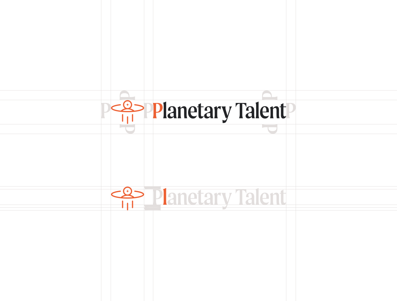
The P & L rule.
When the logomark and wordmark are assembled together, the letters "P" and "L" in our wordmark are the unit of measurement. Everything is built from the type itself.
- POne "P" width of space sits between the logomark and the wordmark, and around the whole lockup. Never place anything inside that zone.
- LThe logomark rises one lowercase "L" above the wordmark and extends two lowercase "L" widths below it, balancing the descender of the "y."
Minimum size & favicon
Below these sizes, switch to the mark.50 px minimum
The full lockup is never used below 50 px tall on screen. It's not built for tiny sizes.
0.75 in minimum
In print, keep the full lockup at or above 0.75 inches tall so the wordmark stays crisp.
Use the mark
In tight spaces (favicons, app tiles, avatars) drop the wordmark and use the logomark alone, down to 25 px.
Logo lab
Drop the lockup on a background. We'll tell you if it works.
Logo lab verdicts, in full
Every background and ink pairing the logo lab can produce. Same data the interactive lab above reads from. Verdicts are ok, warn, or bad.
| Background | Ink | Verdict | Reason |
|---|---|---|---|
| Cosmic Fog | Color lockup | ok | Looks good. The color lockup is the default pairing on Cosmic Fog. |
| Cosmic Fog | White lockup | bad | It disappears. White ink on Cosmic Fog. Use the color or graphite version. |
| Cosmic Fog | Graphite lockup | ok | Looks good. Graphite works on Cosmic Fog for monochrome and single-ink contexts. |
| Pure White | Color lockup | ok | Looks good. The color lockup is the default pairing on Pure White. |
| Pure White | White lockup | bad | It disappears. White ink on Pure White. Use the color or graphite version. |
| Pure White | Graphite lockup | ok | Looks good. Graphite works on Pure White for monochrome and single-ink contexts. |
| Graphite Core | Color lockup | bad | Don't do this. The wordmark is Graphite Core, so it can't be read here. White is the default on dark backgrounds. |
| Graphite Core | White lockup | ok | Looks good. White is the default on Graphite Core. |
| Graphite Core | Graphite lockup | bad | Don't do this. Graphite ink on Graphite Core. Switch to white. |
| Deep Void | Color lockup | bad | Don't do this. The wordmark is Graphite Core, so it can't be read here. White is the default on dark backgrounds. |
| Deep Void | White lockup | ok | Looks good. White is the default on Deep Void. |
| Deep Void | Graphite lockup | bad | Don't do this. Graphite ink on Deep Void. Switch to white. |
| Rocket Flame | Color lockup | bad | Color on color. Never the color lockup on a brand color. White is the default on Rocket Flame. |
| Rocket Flame | White lockup | ok | Looks good. White is the default on Rocket Flame. |
| Rocket Flame | Graphite lockup | warn | Watch the contrast. Graphite reads, but white is the default on Rocket Flame. |
| Galactic Seafoam | Color lockup | bad | Color on color. Never the color lockup on a brand color. White is our main lockup color on Seafoam. |
| Galactic Seafoam | White lockup | ok | Looks good. White is our main lockup color on Galactic Seafoam. |
| Galactic Seafoam | Graphite lockup | ok | Looks good. Graphite also holds up well on Galactic Seafoam. |
| Solar Gold | Color lockup | bad | Color on color. Never the color lockup on a brand color. Graphite is the default on Solar Gold. |
| Solar Gold | White lockup | warn | Watch the contrast. White on Solar Gold is light on light. Graphite is the default here. |
| Solar Gold | Graphite lockup | ok | Looks good. Graphite is the default on Solar Gold. |
| Retro Blush | Color lockup | ok | Looks good. The color lockup is the default pairing on Retro Blush. |
| Retro Blush | White lockup | bad | It disappears. White ink on Retro Blush. Use the color or graphite version. |
| Retro Blush | Graphite lockup | ok | Looks good. Graphite works on Retro Blush for monochrome and single-ink contexts. |
| Watching rocket launch (photography) | Color lockup | bad | Color on color. The blue sky clashes with the color lockup. Only white is approved on this image. |
| Watching rocket launch (photography) | White lockup | warn at 40%, ok at 20% | At 40%: Size it down. White is the approved version here, but at 40% it crowds the image. Drop to 20%. At 20%: Looks good. White at 20% sits well against this image. It's the only approved version here. |
| Watching rocket launch (photography) | Graphite lockup | bad | Don't do this. Graphite gets lost against the sky. Only white is approved on this image. |
| Deep space stars (photography) | Color lockup | bad | Don't do this. The wordmark is Graphite Core, so it can't be read on this dark image. Use white. |
| Deep space stars (photography) | White lockup | ok | Looks good. The background is simple and dark, so white reads cleanly. |
| Deep space stars (photography) | Graphite lockup | bad | Don't do this. Graphite ink on a dark photo. Switch to white. |
| Earth launch (photography) | Color lockup | bad | Too busy. This background is too busy for the color lockup. Only white works here, and only at larger sizes. |
| Earth launch (photography) | White lockup | warn at 40%, bad at 20% | At 40%: Watch the contrast. This background is busy. White only holds at larger sizes, never below 40%. At 20%: Too small here. At 20% the white lockup breaks up against a busy background. Size up or pick a calmer image. |
| Earth launch (photography) | Graphite lockup | bad | Too busy. Graphite can't hold against this background. Only white works here, and only at larger sizes. |
| Planetary City conversation (photography) | Color lockup | bad | Don't do this. This image is too busy for any version of the logo. We don't put the logo on busy photography. |
| Planetary City conversation (photography) | White lockup | bad | Don't do this. This image is too busy for any version of the logo. We don't put the logo on busy photography. |
| Planetary City conversation (photography) | Graphite lockup | bad | Don't do this. This image is too busy for any version of the logo. We don't put the logo on busy photography. |
Misuse
If you do any of these, you're off-brand.+ extras